


Agent-Z Mobile App
Overview
Agent Z is a virtual marketing agency for real estate agents. Delivering high-quality branding, marketing strategy, and content creation for agents on the go.
After having worked for almost 3 years with sales reps and real estate agents, I realized a lot of the shortcomings with the company’s workflow, so I’ve thought of putting together an idea that would make the process run more efficiently.
Tools Used:
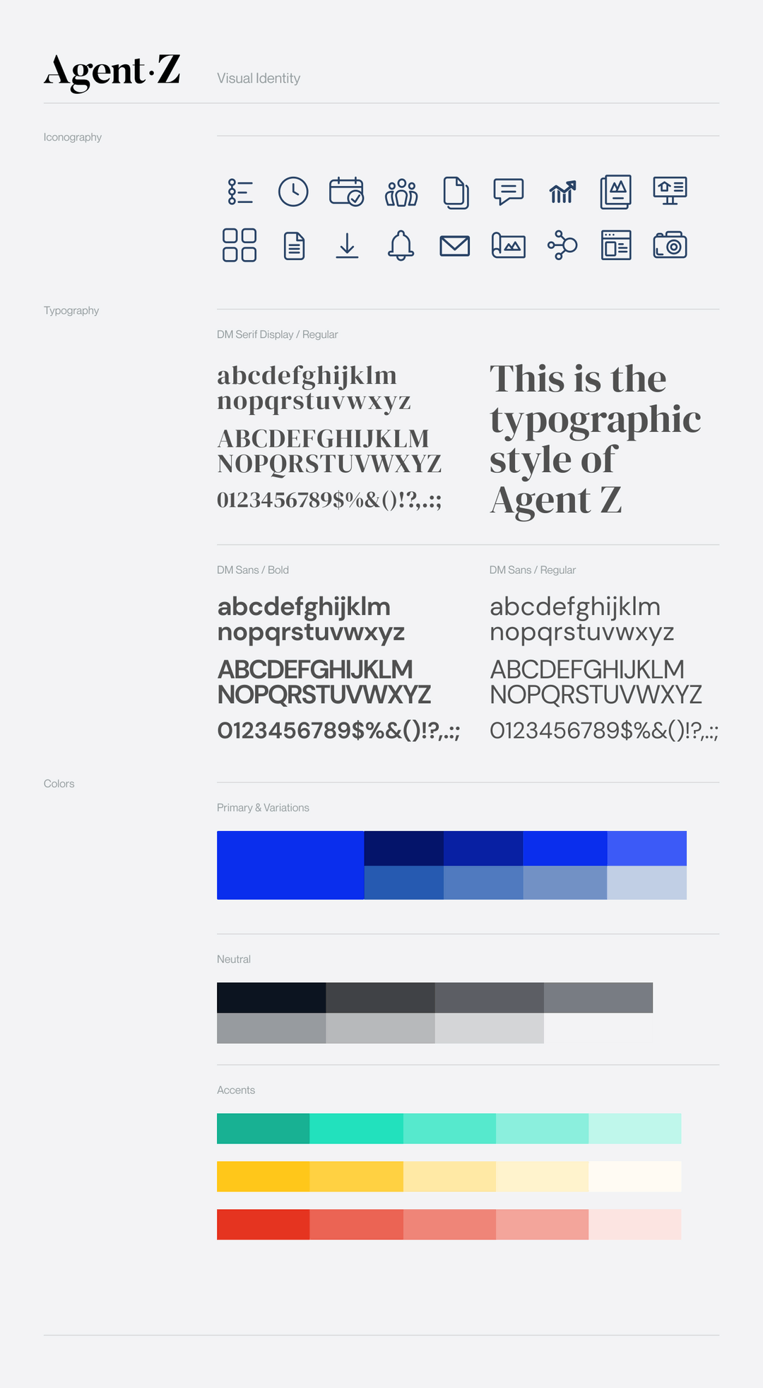
Figma, Illustrator CC, Framer
Methods:
User User Research, Personas, Userflows, Sketches, Prototype
Reseach
Agent Z is for working professionals in the real estate industry: agents, brokers, companies, agencies and teams. Professionals who want to level up their game with a strong branding force and strategy.
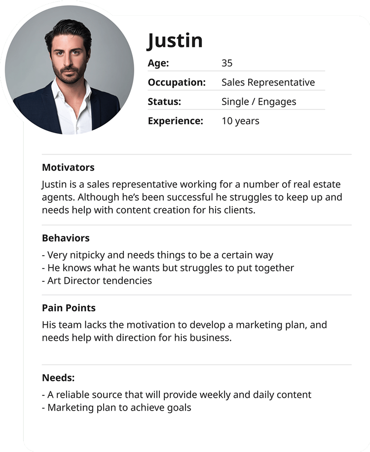
For the personas, I created a profile based on those I've worked with and interacted in the field. Details are taken by in-person inquiry and observations.
The workflow would usually consist of request done through emails or in-person.
To illustrate, a sales representative emails a request for a "Just Listed" postcard and flyer design on behalf of an agent. They usually provide the following: the MLS link to the listing property, agent's information: name, contact, email, DRE#, logo, headshot, company information, property photos, sales content, and a few other details. The problem occurs when the sales rep would forget what to include, or down up miscommunication would occur, leading to tension and frustration on multiple ends.
The research was based on first-hand direct experience, and online content from Real Estate agents, which led to me create an overview of the personas.


Problem
To get a clear picture, I listed the context and conditions, (the when and where), on the use case for the app and think about the environment in which the agents are experiencing the problem.
Context & Conditions:
- Agents are on the go; they need the product to be mobile with a desktop version if they prefer to work in their home/office.
- Agents have too much going and don't have time to think about marketing
- Make agents feel like they have their marketing under control
User Scenario
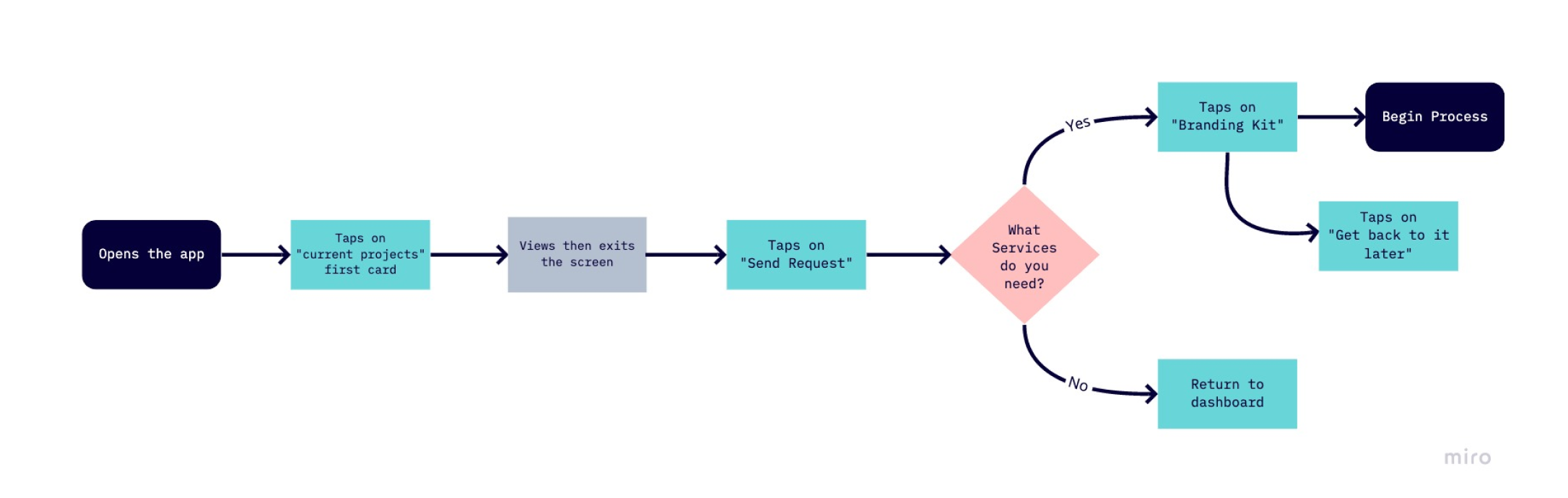
The following user task list informs the userflow.
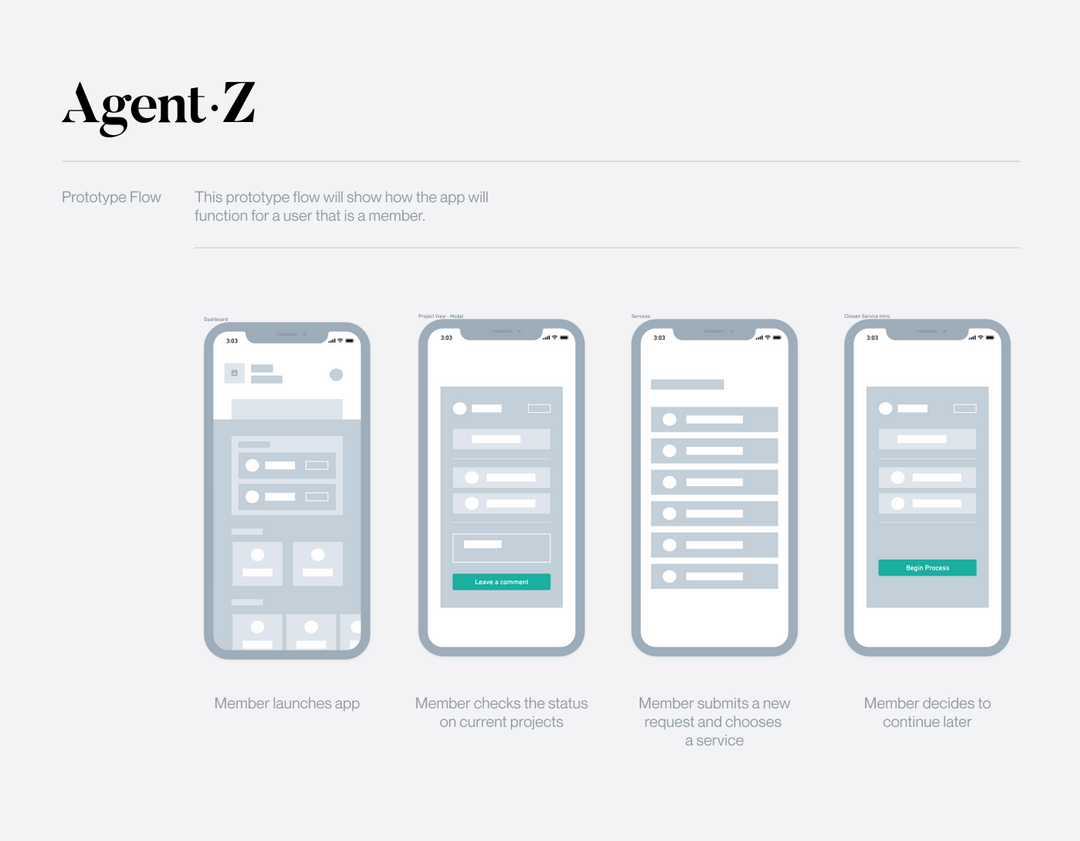
Kelly is going through deals and meeting clients and needs help with defining her brand for her newly thought project, a real estate business podcast. She jumps on her phone and launches the Agent-Z app. Kelly then sends a request for the service.
Synthesis
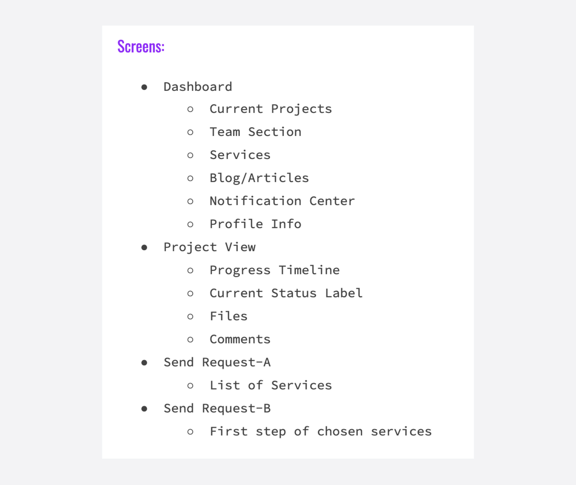
Wireframes
After defining tasks and understanding the product, the interface would work best is in the form of a dashboard for project management and overview. The product will be in a mobile app platform since real estate agents are often on the go and spend less time in front of a desktop computer.
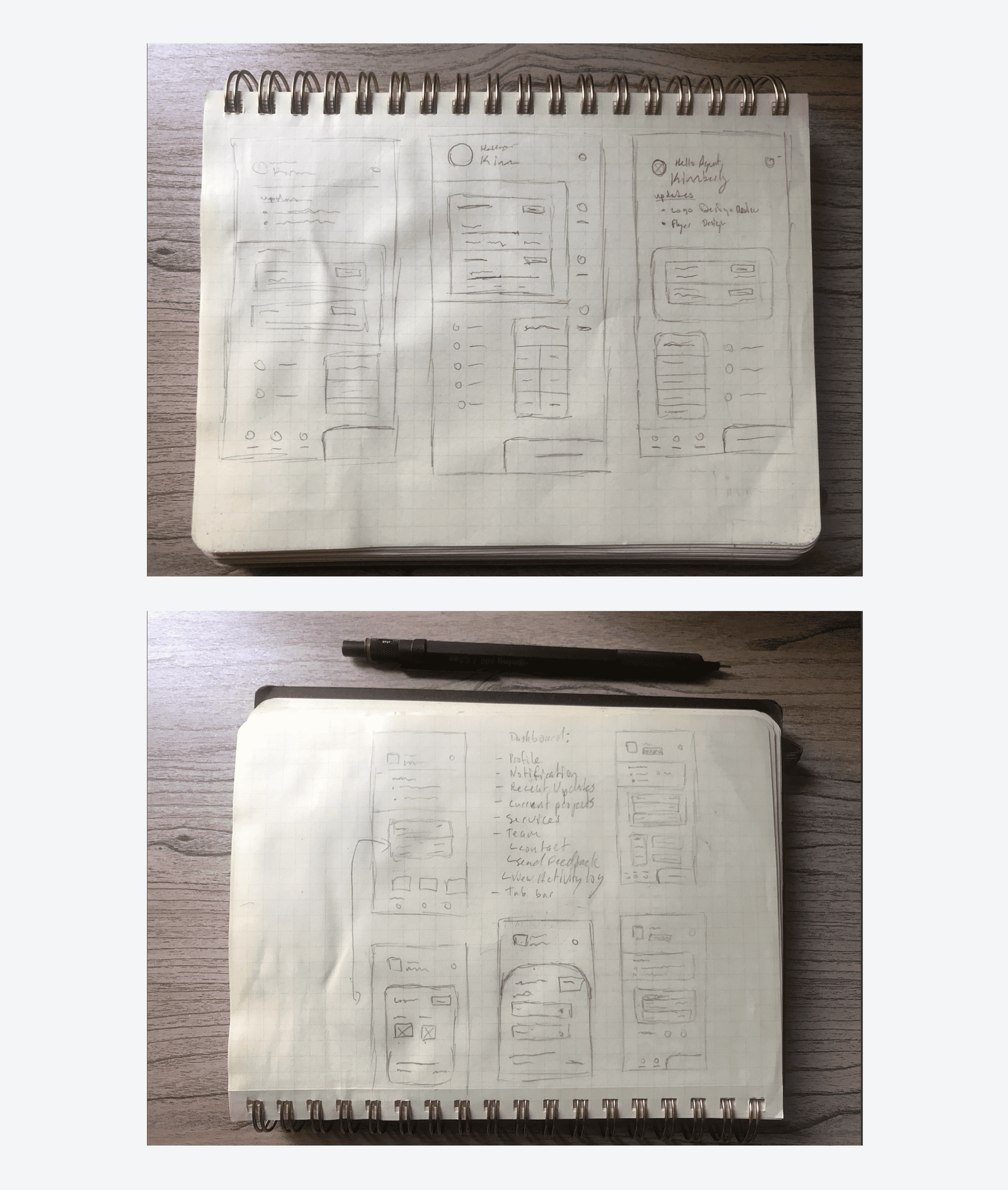
I brainstormed possible layouts for the mobile app. The challenges I had was defining a good workflow of the screens and how they would work together. But through different variations, the solution came through.
Outcome
As a final step, before shipping the product, I would test the prototype with Real Estate industry professionals, along with defined KPIs to measure the success of this solution.
Impact
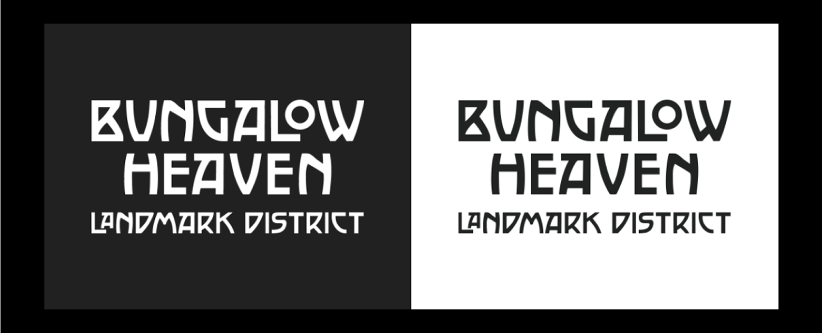
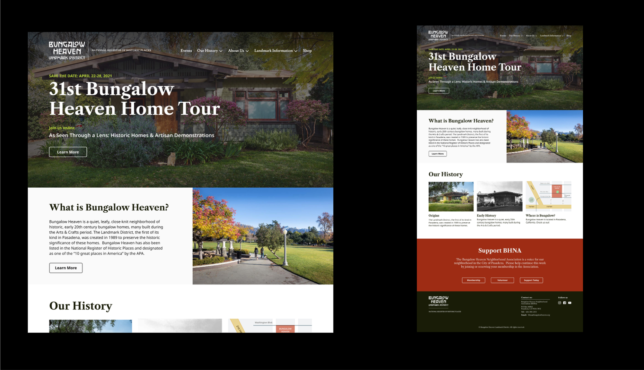
The redesigned site led to a 40% improvement in performance, significantly reducing load times and enhancing responsiveness across devices. By restructuring the information architecture and improving navigation and content layout, user engagement increased by 35% and bounce rate dropped by 20%. The updated CMS empowered BHNA’s small volunteer team to manage content independently without developer support. As a result, the organization was able to streamline updates, boost community engagement and donations, and maintain a professional-grade web presence with limited resources.
Marketing Team
After redesigning the landing pages and form, guided by A/B testing and user behavior insights, we saw a significant spike in leads. In fact, the increase was so dramatic that the sales team became overwhelmed, creating a new challenge around resource allocation.
Takeaways
This project reinforced how effective UX audits and lean branding updates can significantly improve engagement, even for long-standing community organizations. I learned that empowering non-technical teams with intuitive content systems is just as important as visual polish, and that design can play a critical role in helping mission-driven teams adapt to change.
If I were to do it again, I would push earlier for a more scalable CMS approach and clearer prioritization of content workflows to avoid bottlenecks before launch.
Throughout the project, I strengthened my skills in stakeholder facilitation, information architecture, and designing with both technical constraints and community needs in mind.